

Practical Solutions to Track Your Goals
Examples of solutions to track your KPIs, goals, key results, and other metrics. Sheets, Cloud Functions, BigQuery, Looker Studio, and others.

As an engineering leader, you need a solution to track some of your goals, KPIs, and other metrics. If the data stack is mature in your organization, you have all the tools and dashboards available for you. Just pick relevant data, charts, and filters and visualize it for yourself and the team.
But if you need to set up progress tracking from scratch, you can find some example implementations here. The idea is to build a simple solution within less than a day, which is easy to maintain but doesn't necessarily scale well. If, as an engineering leader, you don't have progress-tracking solutions already in your toolset, this project should be enough to start working with many, if not the majority, of goals that require some tracking.
If you are looking only for inspiration, look at the blog post: Simple data tracking solutions for engineering leaders.
In this material, I'll show how to build dashboards and data-tracking solutions.
Table of content
Google Looker Studio and Google Sheets
In this section, I'll show how to build dashboards with Google Sheets and Looker Studio.
The board described in this series of articles can be found here.
Google Looker Studio
Let's start by building the simplest possible dashboard. To do that, you will need two products:
Google Looker Studio
Google Sheets
Connecting Google Sheets as a data source is straightforward and probably the simplest thing you can do with Looker Studio.
Here is the end result you will achieve:

Looker Studio board, ready to be cloned, can be found here.
Here is the Google Sheet, which is the data source for this board.
Feel free to take them and experiment with connecting data sources and building the dashboard presented in the screenshot.
Hints for start
Here are a few things worth keeping in mind when building your first data boards
Keep it simple and informative. Rather than 10 different charts, start with a lower number (1-3), and pick the most informative ones (think of it as a presentation slide)
Think first about what exactly you want to visualize. Do you want to track progress or trends over time, monitor KPIs, or count events? See how easy it is to visualize what you want from the data you have.
Keep source data as simple as possible. Yes, Looker Studio can run complex SQL queries or run some functions over the data you provide. Yet keep it so simple you don't have to debug it.
Example charts
Here are a few ideas for charts you may need.
Tracking progress over time

You will need them to check how things change over time (esp. over an extended period). Examples:
Coverage reports
Migration or re-platforming progress
Number of open tickets, issues, or incidents
What's important here?
Tracking progress over an extended time. Many things don't change day-by-day or even week-by-week. But when you zoom out to see months, you will see the real progress you achieved.
Each change is worth discussing. Check why the line goes up, down, or stays flat. Make sure you and the team understand it and have it under control. The line goes down because of the lack of priority? It's okay as long as this was your intention.
Highlight goals clearly (Style -> Reference Line in Looker Studio). It'll always help if you know how far you are from reaching your goals.
Tracking KPIs or trends

Next to progress (things that should change over time), there are metrics that should be maintained on a certain level (at least).
These can be:
Crash/Incidents rates
Tests flakiness
Build times
Important steps in product funnels (e.g., no. of users who launched the app and then logged in)
What's important here?
Tracking stability over time. Sometimes keeping things on a given level is already an achievement (your crash-free ratio doesn't change even during the rapid growth of the userbase).
Catching spikes - when things unexpectedly change, there must have been an event that will help to strengthen your platform. Do you understand what that was (e.g., a DDoS attack, the external provider being down)?
Planning your objectives - tracking trends over time is also a perfect start to plan your next goals. After a few weeks/months, you know what's the baseline. Your next goal can be to improve it by X.
Counting Events
Actually, this is exactly the same as trend tracking, but you operate on numbers rather than ratios.
You can use it to count different events:
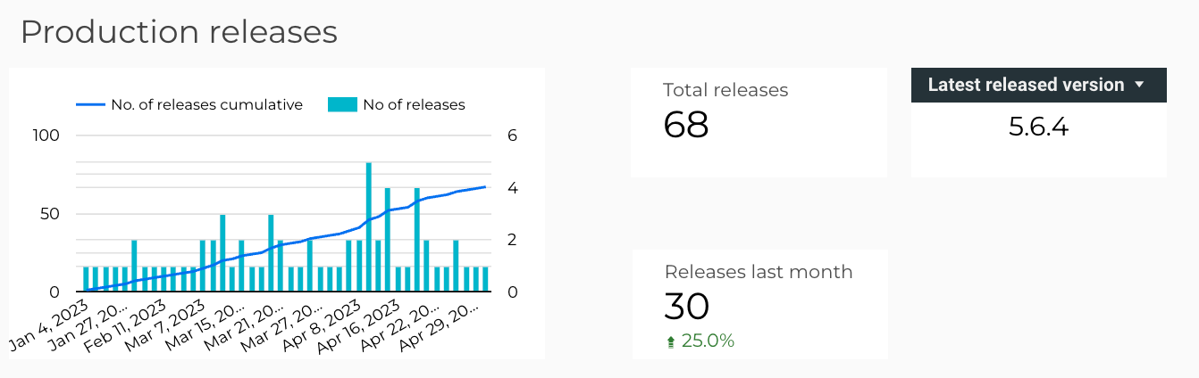
Production releases
Incidents, no. of bugs
Failing tests
API errors
While motivations behind these charts are similar to the ones from % ratios, you can use them for:
Milestone events (e.g., 100 total releases)
"10x" improvement (100 open bugs then vs. 10 open bugs now)
Tracking data when percentage value is inaccurate/irrelevant (3 incidents now vs. 1 incident then is 200% change)
Firebase Cloud Function, BigQuery, and Looker Studio
If Looker Studio boards and static data loaded from spreadsheets or CSV files are not enough for you, here I'll show how to build the simplest cloud function, which takes data points via API and stores them into Google Big Query.
